How to Read a Lens's MTF Chart
An MTF chart looks intimidating but takes about 10 seconds to read once you know what the lines mean. Here's how to actually use one to compare lens sharpness.

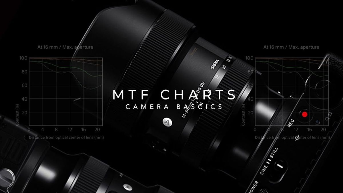
Every serious lens review includes an MTF chart, a grid of curved lines that looks intimidating and gets skipped by most readers as a result. It shouldn't be skipped. An MTF chart is one of the most objective, manufacturer-published ways to actually compare lens sharpness and contrast, once you know what the lines are actually measuring.
What MTF Actually Measures
MTF stands for Modulation Transfer Function, a measurement of how well a lens preserves contrast when reproducing fine detail. The test works by photographing patterns of alternating black and white lines, then measuring how much contrast survives between those lines once they pass through the lens. A perfect lens would reproduce pure black and pure white with zero loss. Every real lens loses some contrast, and MTF quantifies exactly how much, on a scale from 0 (no contrast survives, lines blur into solid gray) to 1.0 (contrast fully preserved).
Reading the Axes
The horizontal axis represents distance from the center of the frame, moving outward toward the corner. The vertical axis represents MTF score, contrast retention, from 0 to 1.0. A lens's performance is almost always strongest at the center and weakest at the edges and corners, which is exactly why the chart is read left to right as "center to edge" performance.
As a general benchmark: an MTF score above 0.6 is considered acceptable, and a high-performing lens will score around 0.8 or higher, especially toward the center of frame. Scores approaching 0.9-1.0 represent genuinely excellent contrast retention.
Why There Are Multiple Lines on One Chart
This is the part that actually confuses people, and it's simpler than it looks once broken down. Most manufacturer MTF charts plot four lines, because two separate variables get tested simultaneously.
Line frequency (spatial frequency): Charts typically show two sets of line pairs, a coarser set (often 10 line pairs per millimeter) and a finer set (often 30 line pairs per millimeter). The coarser lines measure the lens's contrast performance on larger, bolder detail. The finer lines measure performance on genuinely fine detail, a tougher test that always scores lower. This is why every chart has a higher-scoring pair of lines and a lower-scoring pair, they're testing different levels of detail, not different apertures or settings.
Orientation (sagittal vs. meridional): For each frequency, the lens gets tested with two differently-oriented line patterns. Sagittal lines (usually solid) run radially, outward from the center toward the corner. Meridional or tangential lines (usually dashed) run perpendicular to that, tangent to the circle at each point. Lenses genuinely perform differently on these two orientations, which is why both get measured and plotted separately rather than averaged into one number.
The Single Most Useful Thing to Look For
Beyond raw height on the chart, the gap between the sagittal and meridional lines at any given point tells you something specific: astigmatism. At the exact center of the frame, sagittal and meridional lines are always identical, there's no directional difference to measure yet. As you move toward the edges, if those two lines start separating from each other, that's the lens rendering detail differently depending on orientation, blur that isn't uniform in all directions.
A lens where the sagittal and meridional lines stay close together across the frame is rendering detail more consistently, regardless of orientation. A lens where they diverge significantly toward the edges is exhibiting real astigmatism at those points, worth knowing if your work involves a lot of off-center detail or corner-to-corner sharpness, architectural or landscape work in particular.
What MTF Charts Don't Tell You
A few real limitations worth knowing before treating an MTF chart as the complete picture. Most manufacturer charts are computed/theoretical data based on lens design, not measured from physical production copies, meaning real-world sample variation isn't reflected.
Charts also typically show performance at a single aperture (usually wide open), not across the lens's full aperture range, so a lens's diffraction-limited performance at f/16 won't show up on the standard wide-open chart. And an MTF chart says nothing directly about distortion, vignetting, chromatic aberration, or color fringing, all separate optical characteristics measured and reported independently, the same characteristics an apochromatic lens design is specifically built to control.
How to Actually Use This When Comparing Lenses
Look at where the top pair of lines (coarse frequency) sit at the center, that's a quick read on overall contrast and general sharpness. Then check how much the lines drop moving toward the edge of the chart, a lens with a smaller drop-off is more consistent corner-to-corner. Finally, check the gap between sagittal and meridional lines at the edges specifically, a bigger gap means more astigmatism in that part of the frame.
Comparing two lenses' MTF charts side by side, at the same aperture and frequency, is a genuinely reliable way to predict which one will actually look sharper and more contrast-rich in real use, more reliable than marketing copy, and more objective than a single reviewer's subjective impression.
The Signal in the Noise
An MTF chart isn't marketing, it's the closest thing to an objective sharpness spec sheet most lens manufacturers publish. Once you know that the multiple lines represent frequency and orientation rather than some confusing overlapping mess, reading one takes about ten seconds: check the height (contrast), check the drop-off toward the edges (consistency), and check the gap between line types (astigmatism). That's genuinely more useful for predicting real-world lens performance than most spec sheets manufacturers publish alongside it.
Do you actually check MTF charts before buying a lens, or do you rely more on real-world sample images and reviews? Curious how you weigh it, drop it in the comments.