Why Fake Moonlight Looks Fake — and How to Actually Get It Right
Fake moonlight fails because it uses soft blue light. Real moonlight is hard, directional, and blue-green for physiological reasons. Here's the physics and the gel recipe.

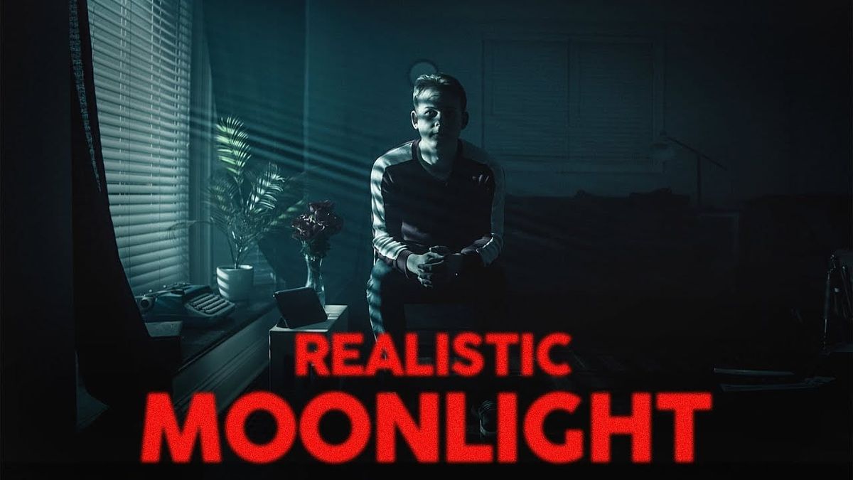
Most fake moonlight fails for the same reason: filmmakers reach for soft blue light and call it done. The physics of actual moonlight don't support that choice, and cameras are unforgiving about the difference.
Filmmaker William H. Baker breaks down the science behind why moonlight looks the way it does — and what it actually takes to replicate it on set.
Why Moonlight Is a Hard Light Source
The most common mistake in moonlight lighting is using soft sources — large diffused panels, bounced light, broad fixtures near windows. The result looks like streetlight, not moonlight.
The reason moonlight is hard has to do with distance. The moon subtends approximately the same angle in the sky as the sun, which means it produces the same kind of parallel, directional shadows that sunlight does. Moonlight from a real moon creates hard, defined shadow edges — not the soft, wrapping light that a nearby diffused source produces.
As Baker puts it: "The further from the window we bring our light the more directional the light will be and the more parallel our shadows will be."
The practical implication: the light source needs to be as far from the subject as possible, and it needs to enter the set from a high angle to mimic the moon's position in the sky. In a small interior, that's a problem — there often isn't enough distance to achieve the necessary directionality.
The Mirror Solution for Small Spaces
Baker's solution for small interiors where light-to-subject distance is limited: use mirrors to extend the effective distance without physically moving the fixture.
Placing a mirror outside a window and bouncing the light through the window into the set increases the distance the light travels before reaching the subject. It also allows the angle of entry to be adjusted without repositioning the fixture itself. The result is more parallel shadow behavior in a space that wouldn't otherwise have room for it.
This is a practical technique with a straightforward physics basis: the light travels farther, the beam stays more collimated, the shadows stay harder. The mirror doesn't change the quality of the light source — it changes the effective working distance.
The Purkinje Effect and Why Blue-Green Is Correct
Here's why the standard "add blue gel" approach is partially right but incomplete.
Moonlight itself is not blue. It's reflected sunlight, which means its color temperature is similar to daylight. The reason humans perceive moonlight as blue-green is physiological: in low-light conditions, human vision shifts from cone cell dominance to rod cell dominance. Rod cells are more sensitive to the blue-green part of the spectrum, which is why our eyes report moonlight as having a cool, desaturated, blue-green quality even though the light itself isn't particularly blue.
Cameras don't make this shift. A camera set to a daylight white balance under actual moonlight would render it as approximately white. To replicate the perceptual quality of moonlight as humans experience it — the blue-green cast that makes nighttime feel like nighttime — the color has to be introduced artificially.
As Baker explains: "Cameras don't operate like our eyes do so we have to manually change our light to the proper blue-green."
The Gel Recipe
Baker's specific recommendation for replicating the Purkinje effect on set: a combination of Full CTB (Color Temperature Blue) and White Flame Green gel, used together.
Full CTB shifts the light toward blue by raising the apparent color temperature significantly. White Flame Green adds the green component that the Purkinje effect introduces into moonlight perception. Used together, they produce a blue-green quality that reads as moonlight to camera in a way that blue gel alone doesn't.
Both gels are available from Rosco and Lee, the two primary gel manufacturers. The specific combination will need to be calibrated to the fixture and the scene — the proportions matter more than the exact gel choice, and testing on camera before the shoot is necessary to dial in the result.
Color Grading as the Second Half of the Problem
Moonlight scenes tend to render as nearly monochromatic — low saturation, reduced color separation between different hues. Baker's point is that the color grade is as important as the on-set lighting for achieving the final moonlight look.
Because moonlight desaturates the image perceptually, a color grade that pushes saturation down across the scene and leans the remaining color toward blue-green will reinforce what the practical lighting is doing. A scene lit for moonlight but graded with normal saturation will partially undercut the effect — the eye expects moonlit scenes to look drained of color, and a saturated grade fights that expectation.
The two elements work together: get the directionality and color right on set, then finish the look in grade rather than trying to do all of it in post or all of it practically.
Competitive Context
The standard industry shorthand for moonlight — blue gel, soft source, low intensity — produces a recognizable cinematic night look that audiences accept as a convention even though it doesn't match the physics. Baker's approach isn't arguing against the convention so much as offering the tools to produce a more physically accurate version of it.
The difference shows most clearly in shadow behavior. Soft moonlight produces no discernible shadows or soft-edged ones. Correctly executed hard moonlight produces distinct, parallel shadows that move coherently across a set as subjects move through the space. That quality is what separates moonlight scenes that feel like real exteriors from ones that feel like a set lit blue.
The Signal in the Noise
The Purkinje effect is the most underappreciated piece of this puzzle. Most cinematographers know to use blue gel for moonlight. Fewer know why blue-green is more accurate than pure blue, or that the perceptual quality they're trying to replicate is physiological rather than photometric. Understanding the mechanism behind the effect produces better results than following a recipe without knowing what it's replicating.
The distance principle is equally important and more commonly violated. A soft source near a window will always read as interior practical or street light regardless of what color gel is on it. Getting the distance right — using mirrors if necessary to achieve it in small spaces — is what makes the light read as coming from the sky rather than from a nearby source.
Resources & Reads
- William H. Baker's full video: https://www.youtube.com/watch?v=9gb9bNrb8P4
- Rosco gel selector (for CTB and White Flame Green): https://rosco.com/gel-filter-selector
- Lee Filters color temperature blue gels: https://leefilters.com/lighting/colour-list.html